Details of the personal life of a yellow
Óbuda Cultural Centre, January 2013.
Opening: Flóra Barkóczi, art historian
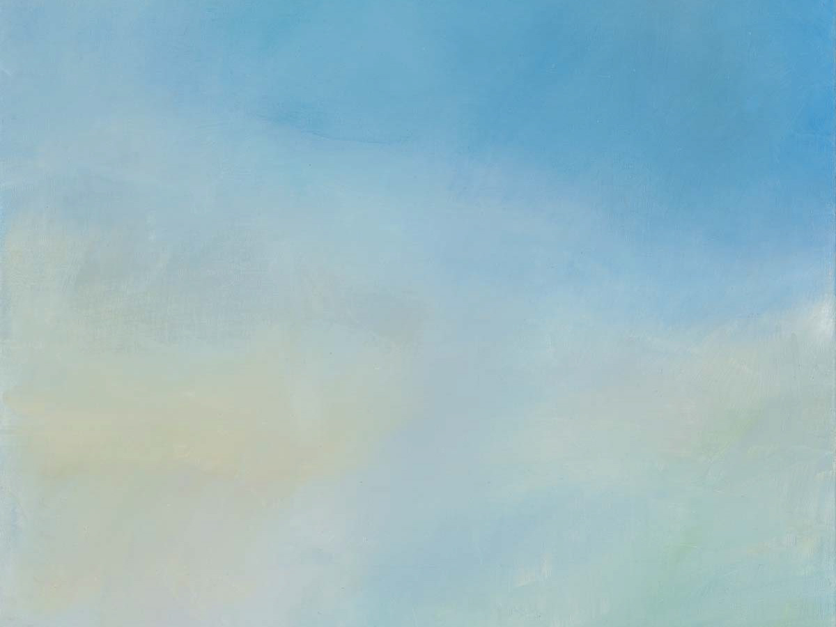
Zsuzsa Kalas had another exhibition opening in Óbuda one year ago at Társaskör Gallery titled the Visible Invisible. At that time the artist depicted the visible celestial phenomena and delicate gradations in the sky. Colour again plays a significant role in the now exhibited ‘yellow pictures’ at the Óbuda Cultural Centre. As Zsuzsa Kalas puts it, “There is a yellow somewhere around the orange and the lemon.” Johannes Itten in his work The Art of Color defines yellow as the colour which is most filled with light. Yellow is known to be the colour of sunlight, sunbeam, sunshine, the radiance of the Sun. The artist’s yellow, according to her, most often appears shortly before sunset and after a short while it disappears. The painter therefore sees in front of her a colour and this colour is known only by her. In order to share it and to possess it she must paint it.
The exhibition was named after a group of pictures, a series called Details from the personal life of a yellow which Zsuzsa Kalas painted in 2012. These yellow-dominated pictures were painted of facades, streets and walls. We might say that ‘so many pictures, so many tones of yellow’. If this tone of yellow was just an easy-to-mix colour, it would not have been necessary to paint nearly two dozen paintings. The artist depicted her observations and the objects around her when their colour matched the tone she had remembered. This yellow is very close to the one Claude Monet uses when painting Impression, Sunrise with vibrant tones and reflecting light; or which appears in the mystical glow on the paintings of the Impressionists’ predecessor, William Turner. Each picture of this series is an attempt to identify and capture this particular hue of yellow.
The houses, streets, walls, rain pipes, or the caravan at the back of the garden that appear in the pictures are irrelevant as objects. The artist’s aim was not so much the representation of the surroundings around her but to seize a certain tone and reflect an impression. The buildings and other objects that Kalas paints serve merely as a surface for the painter to capture the desired tone, thus making it timeless. A group of paintings called Melting Lights may very well be an exception, when the artist aimed to capture the puzzling “late afternoon yellow” – in this case the light itself – as it arrives directly from the Sun. In addition, Zsuzsa Kalas pays special attention to her technique. She applies multiple thin layers of paint and the result is the subtle change in the tones of the colours.
Looking at these paintings we will not only meet the different shades of yellow but – first of all – hues of blue, red, pink and purple or even green. Without the use of these colours, Kalas’ mission – i.e. to paint the colours of her memory – would have been impossible. It was necessary to use such a wide spectrum of colours to let this yellow unfold in contrasts with the other colours. A good example is the picture called Street View, where there is only a glimpse of this certain yellow against the blue-purple-grey tones of the trees, the fence and the walkway.
Another group of the exhibited works is Zsuzsa Kalas’ Illustration for a Tale series from 2006. These paintings have not yet been made in search for the previously mentioned tone but the colour yellow is already in their focus. When painting this series the artist was interested in another problem: how to tell a story with abstract images. Nonfigurative components here too illustrate the ‘private life of a yellow’, but now the focus is on the form instead of the colour. The story evolves through the meeting of the different shapes and shades of the images of the series. The relationships between the abstract elements suggests certain situations and atmospheres which invite the viewers to reconstruct their scenario. The pictures inspire us to capture the imaginary story in an active way and to use our imagination freely.
Besides the changes of formal relations from image to image, colour plays an important role in the Illustration for a Tale series as well. This time the “story” of yellow unfolds in its contrast with the colour blue. Here the artist also worked with several layers of paint and created a wide range of colour gradients as yellow transitioned to blue.
Both shape and colour accuracy are important for Zsuzsa Kalas. While in the 2006 series, to illustrate the imagined story, it was necessary to meticulously arrange the yellow shapes, in the pictures made in 2012, the aim was to explore the imagined hue and thus to define it as precisely as possible. This determination process, the search for and the establishing of the colour, was facilitated by the small sketches made about the painter’s immediate surroundings. These are displayed in the show-cases. On these sketches we can see the details of the artist’s living space, personal life, which were necessary not only to determine a certain composition but also made it possible for the artist to formulate an attitude and impression and to recall the colour effects experienced during the painting of these sketches.
Zsuzsa Kalas is interested in recognition, perception and the phenomena on the verge of impression and visibility. Her aim during painting these pictures, which are exhibited here at the San Marco Street Cultural Centre, was to transform these phenomena of the outside world to be visible again. The works exhibited at the Details of the Personal Life of a Yellow exhibition express the painter’s personal attachment to the colour yellow. The Yellow pictures sometimes show the process of the search for a specific hue, other times they look at the relationship between colour and form occasionally balancing between figurative and abstract expressions. The representation of the searching process for colours and forms can provide an insight not only to a Yellow’s private life but also to the artist’s.